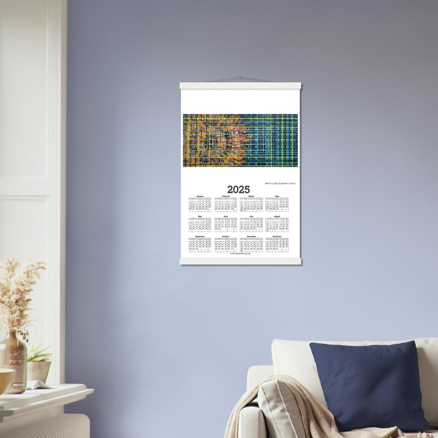
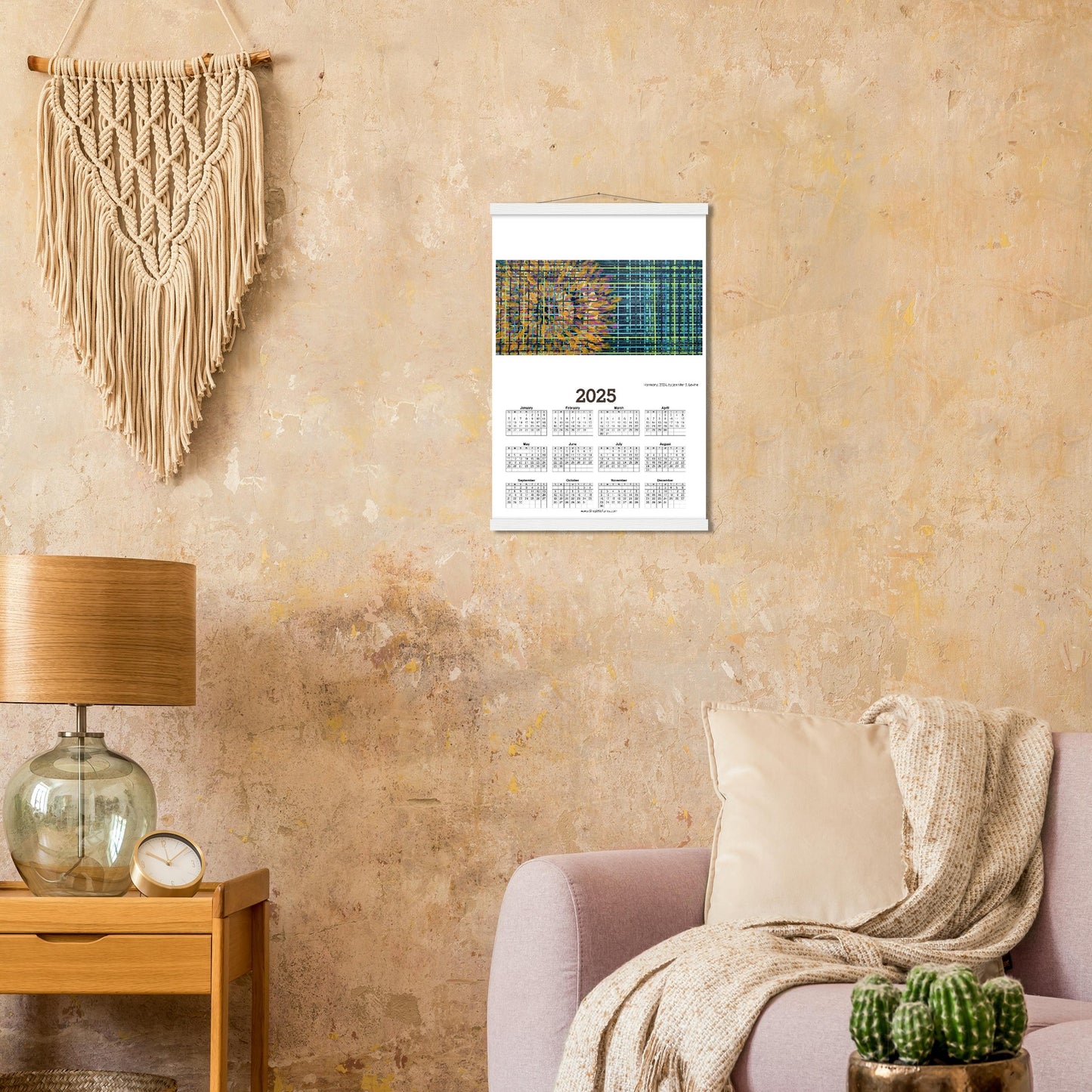
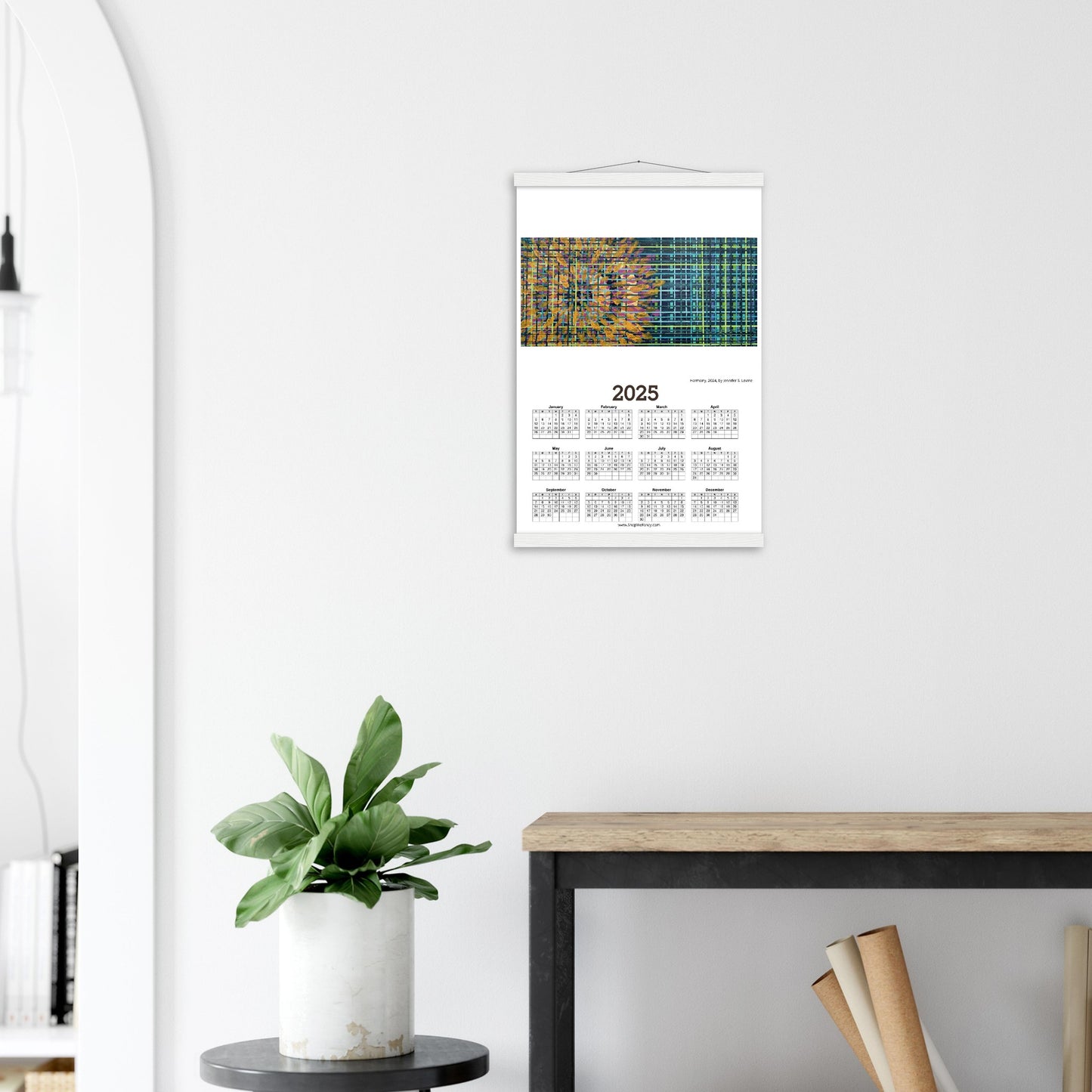
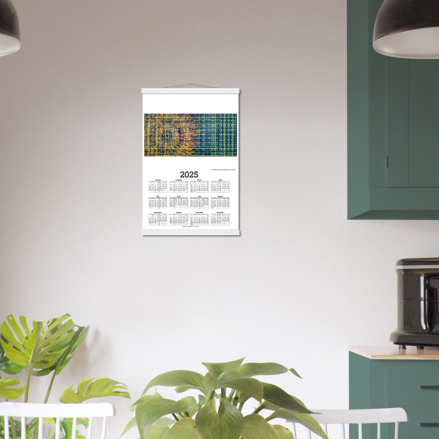
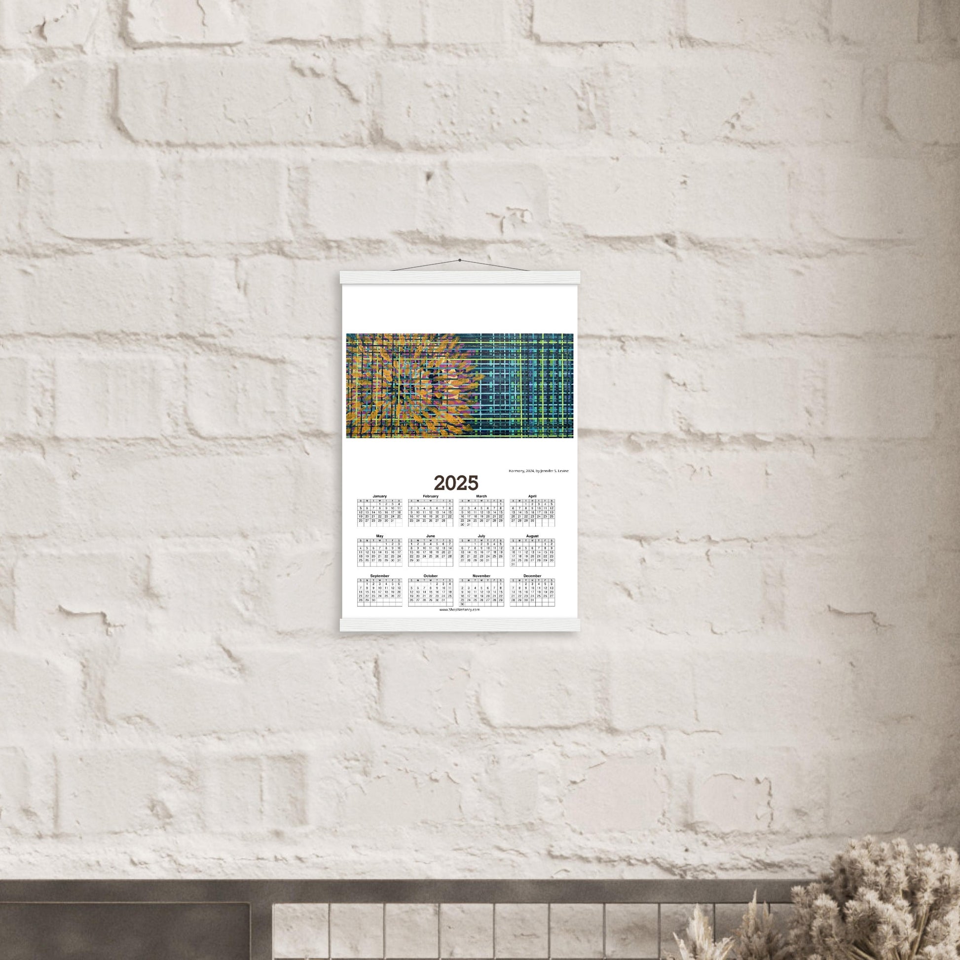
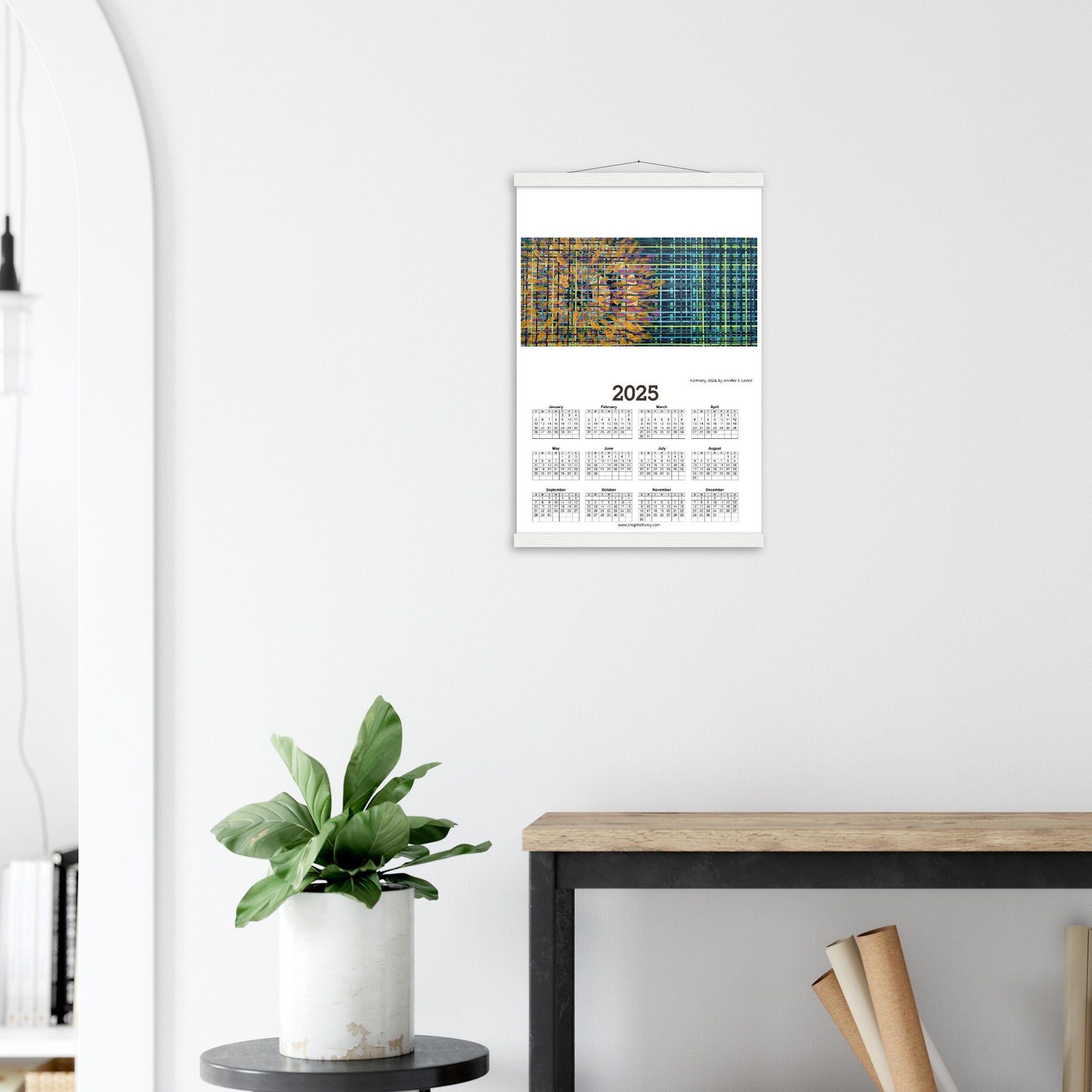
HARMONY 2025 Year at a Glance on Premium Matte Paper Calendar with Hanger
HARMONY 2025 Year at a Glance on Premium Matte Paper Calendar with Hanger
Couldn't load pickup availability
Our minimalist wooden hangers are made with four magnetic wooden dowels, two that clamp to the top of your print and two that clamp to the bottom to give a vintage look and feel. The poster is made with heavier-weight white matte paper that has a natural, smooth uncoated finish that feels luxurious to the touch.
While the poster and hangers are packed separately in one box, final assembly is required. Don’t worry; it's a snap to put them together.
Features:
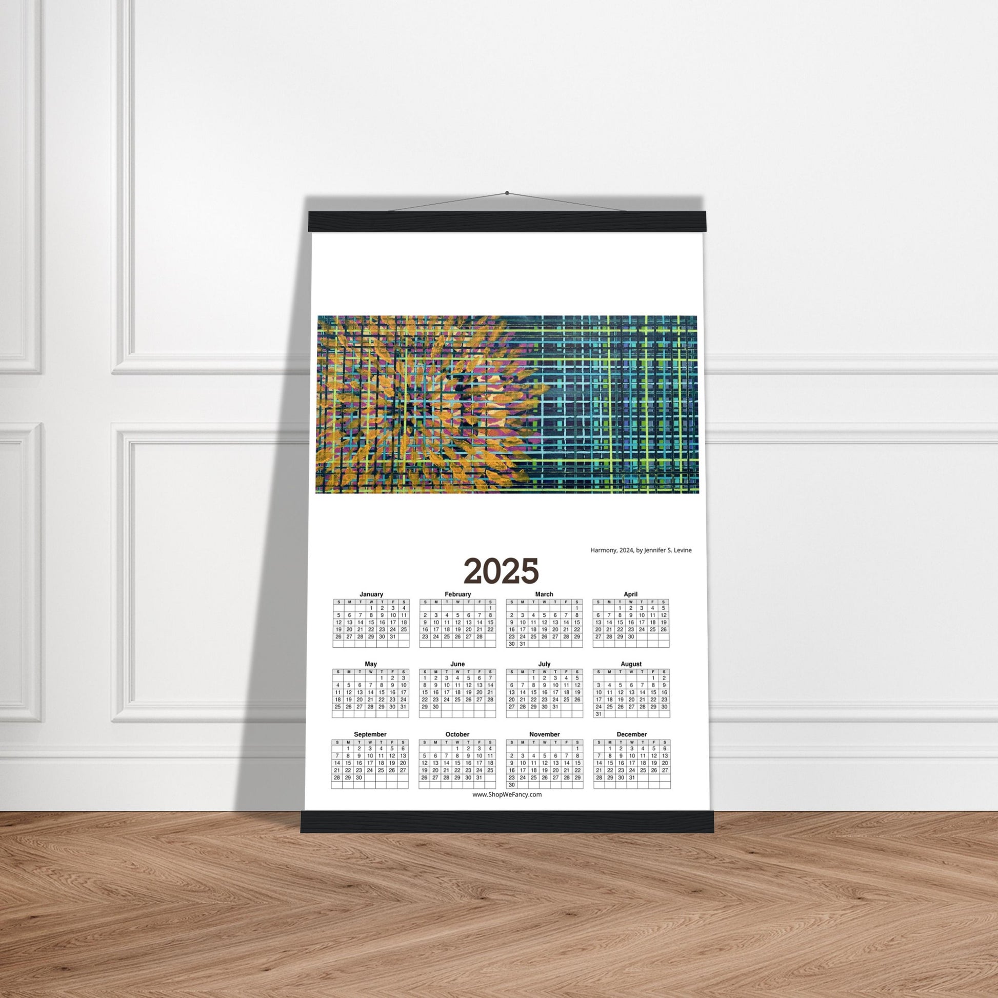
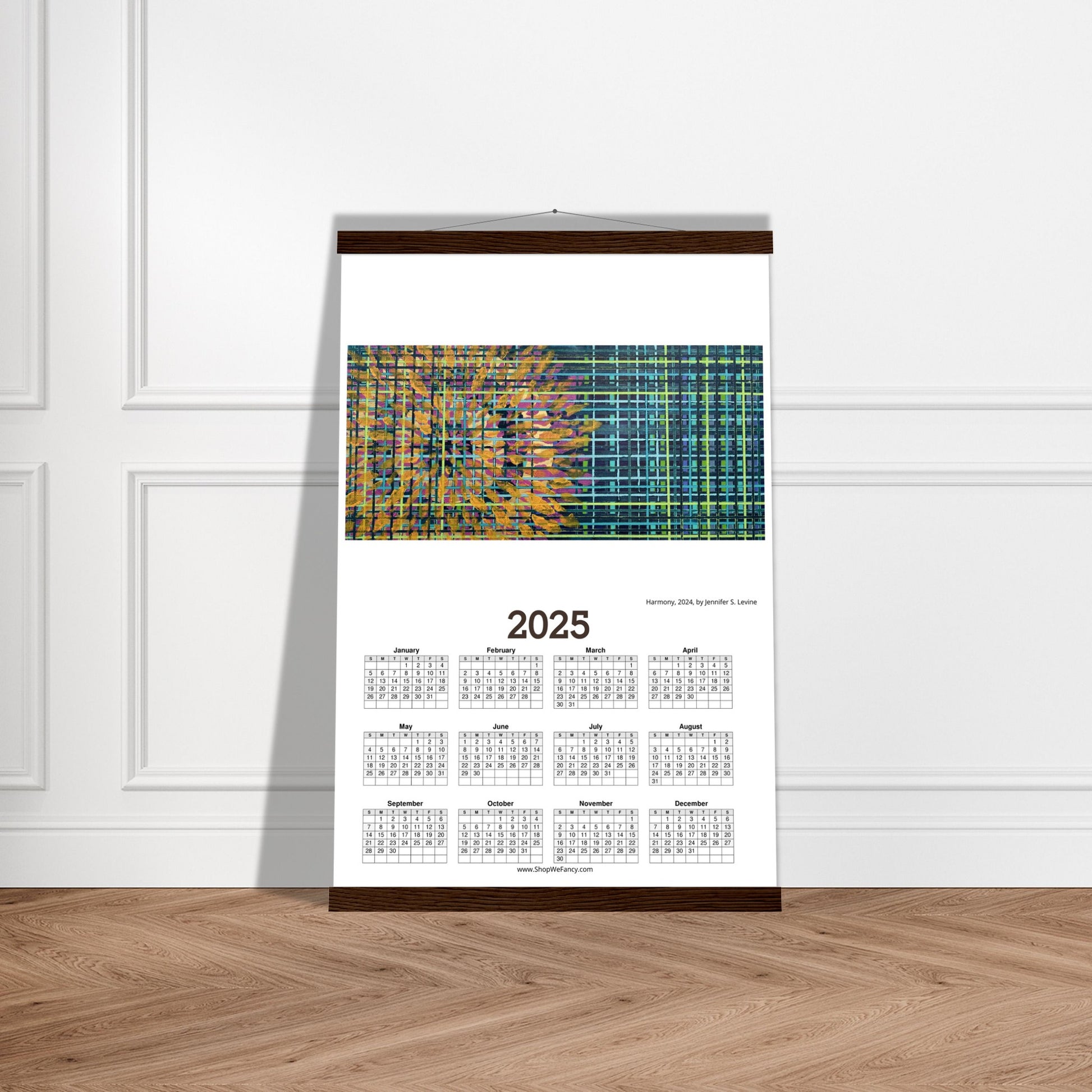
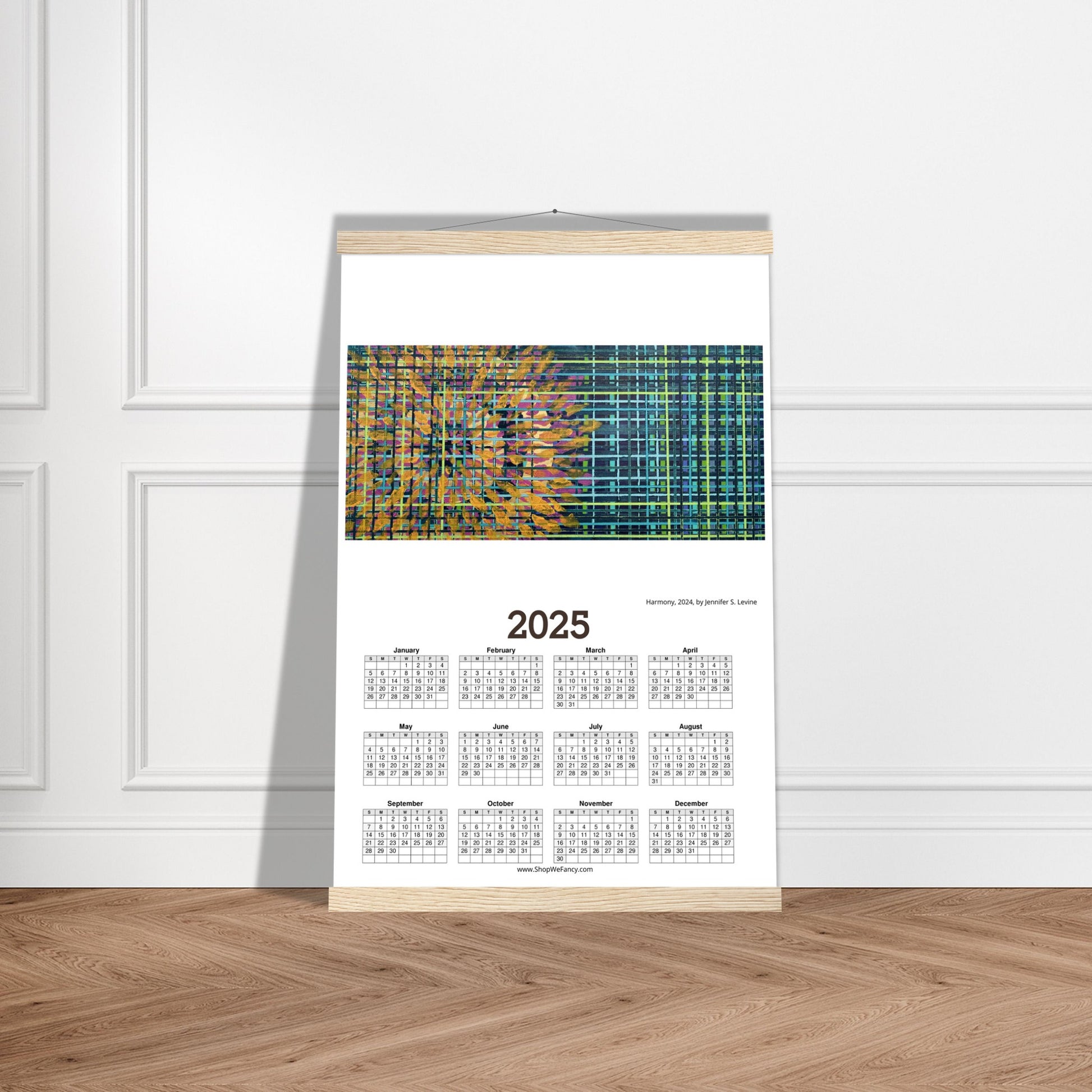
- The hangers are made from pine and come in natural wood, white, black or dark wood.
- The cotton rope attached at the top matches the hanger color.
- Designed magnetically, the hangers do not damage the poster and also makes it easy to switch prints, making it a versatile and durable option.
- The 200 gsm / 80 lb paper weight makes it durable and long-lasting.
- FSC-certified paper and hangers or equivalent certifications, depending on regional availability. It’s better for the people and the planet.
- Each poster and hanger is shipped in robust packaging, ensuring it arrives in pristine condition.
- Paper sizes may vary slightly by region. For the US and Canada, the measurement is in inches, while for the rest of the world, it is in centimeters.
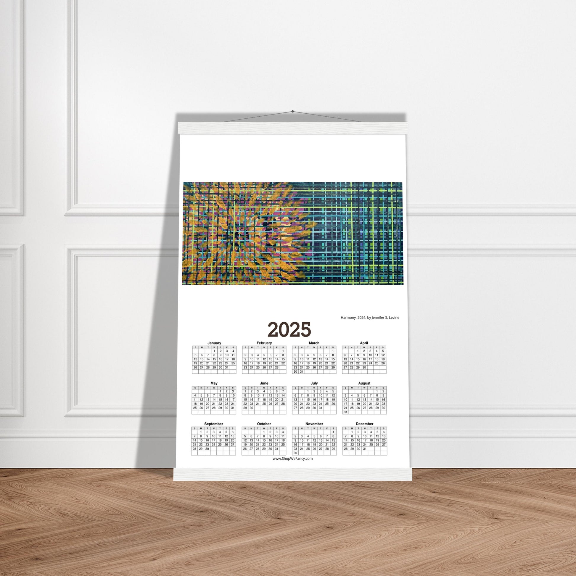
ABOUT THE PAINTING
Harmony: Acrylic on canvas, 10 x 20 IN.
The word “harmony” gets thrown around a lot. We think of it with music and relationship but with this piece, I discovered harmony within the study of opposites.
Harmony comes from the Greek word “harmonia” which means joint, agreement and concord. The Cambridge Dictionary defines it as an agreement of ideas, feelings, or actions, or a pleasing combination of different parts. One could easily extrapolate those definitions to mean harmony underscores the similarity of elements or the balance found in common foundations. But then, harmony can also be found in the fusing of opposites, such as found in this piece.
The theme of this piece is harmony, as stated, but the inspiration came from nature. It’s always fascinated me that most foliage in the living world is some shade of a cool green yet flowers are all the things that are bright and warm. Now, photosynthesis with the light spectrum, bees pollinating as they’re attracted to bright colors, birds and bees… the flows of nature that can be parsed and explained through science but there’s still something magic there. The magic is harmony, connection. In a world full of contradictions and missteps, it’s hard to see those connections and find that purpose as life goes on… reflect on a flower. Living really isn’t that complicated but it sure feels that way sometimes. Reflect on a flower.
To express this construct and simplify heavy pondering on a 2D plane, I thought about the grounding and structure we don’t see in nature. All those chemical bonds and dry mathematical theorems where we overthink and analyze, from that the background was born in shades of stems before roots and supporting the flower. Then, came the flow of the flower in vibrant, radiating orbs. But, harmony isn’t something explained, it’s shown without words. Three components in this painting’s composition were used in this study of opposition to reflect the true harmony we often forget: warm versus cool in tone, linear versus round in form and, lastly, painterly versus formal in brushwork. In this piece, I hope the viewer sees the harmony they feel they’re missing is actually all around them in all the great small things.
Remember, reflect on a flower.


