

BOUNTIFULNESS Outdoor Pillows
BOUNTIFULNESS Outdoor Pillows
Couldn't load pickup availability
Talk about summer love'n, or anytime of year, we've got the cushions for all seasons. 100% polyester insert, poly spun shell, fade resistant printing with treatments in UV protection, water and mildew resistance, these pillows have got you covered! As an added bonus, there's quite the selection. Your choice between pillow or shell only, both with conveniently hidden zippers and 3 size variants (16 x 16 IN, 18 x 18 IN and 20 x 20 IN). Don't worry about cleanup: shells are machine wash, cold with mild detergent on gentle. Don't bleach or tumble dry.
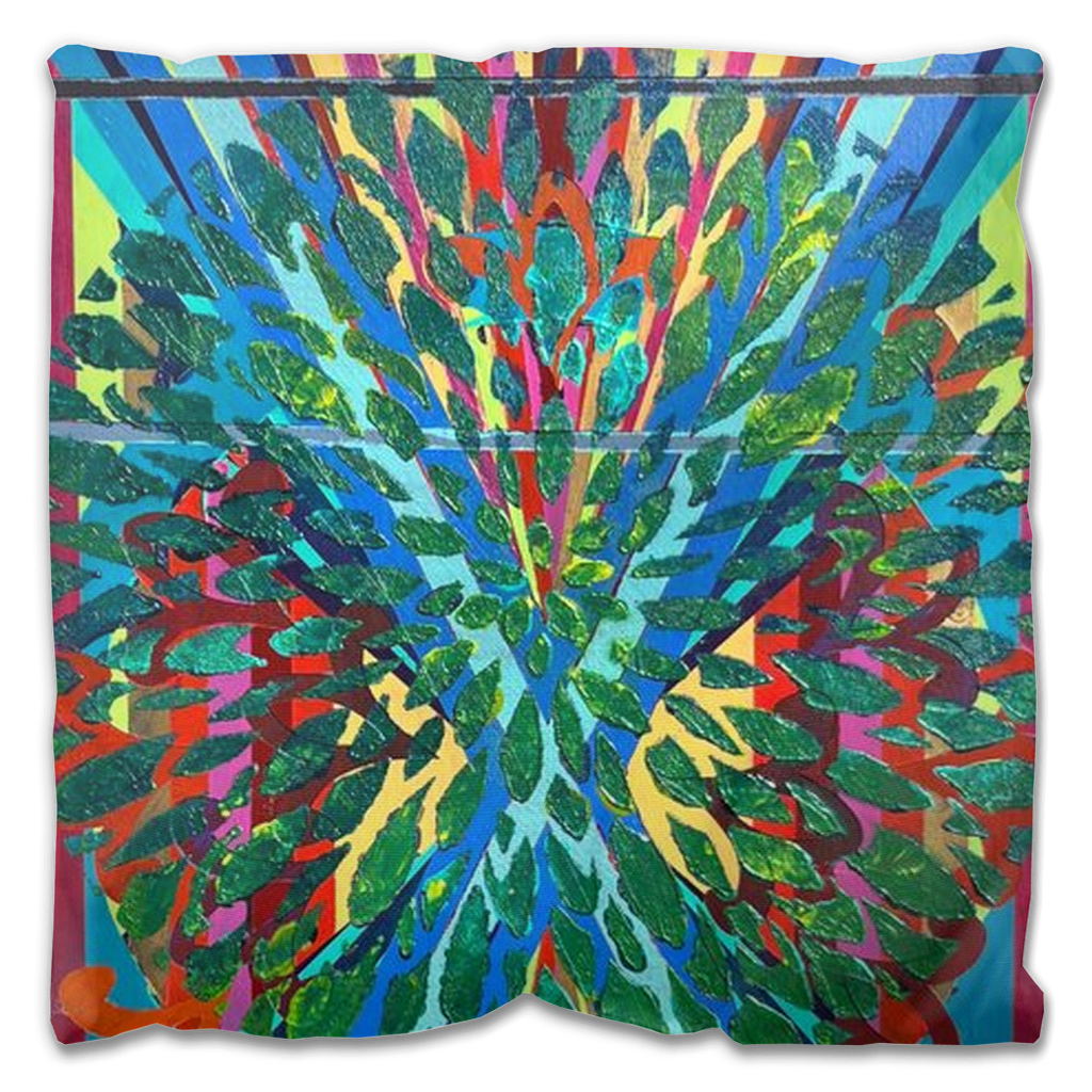
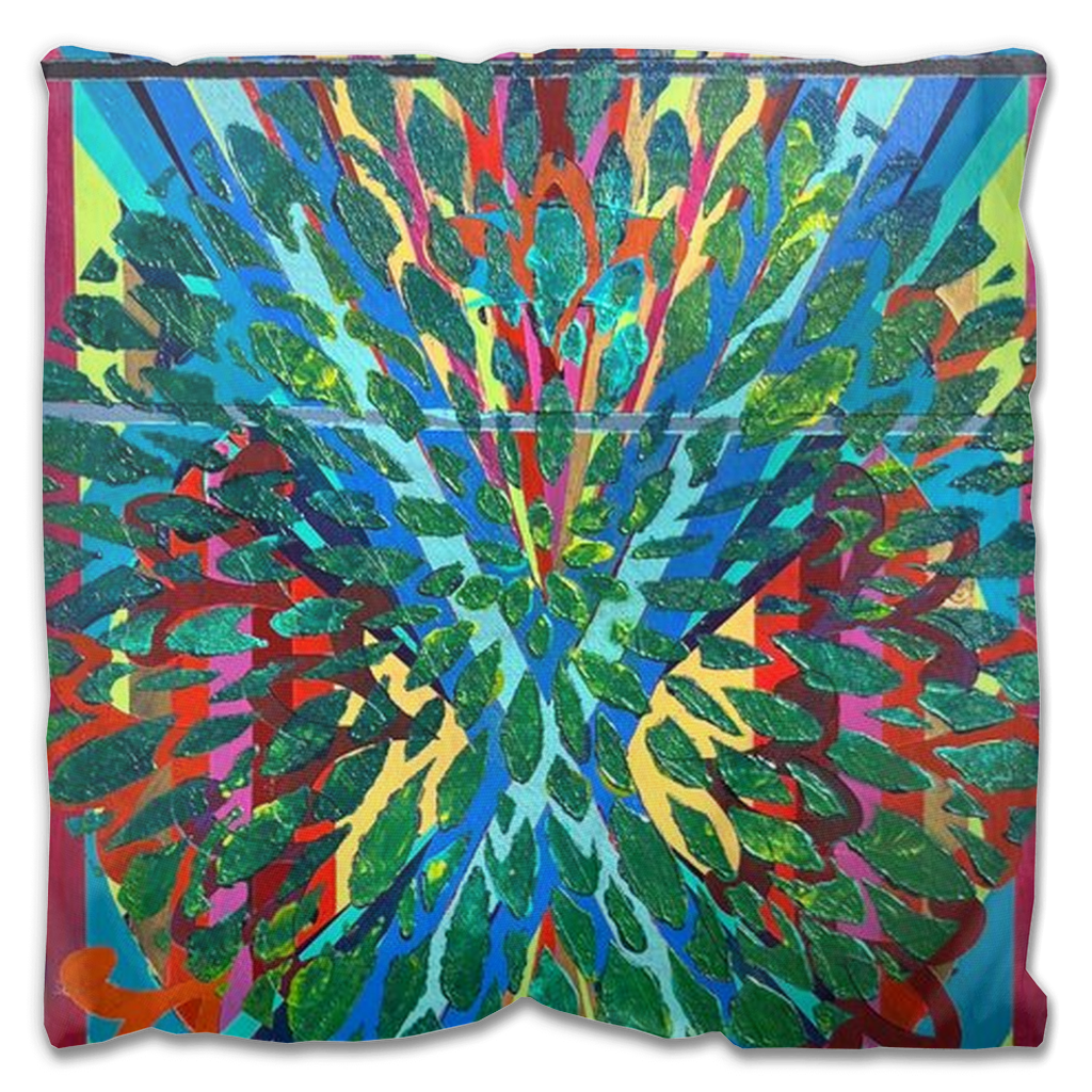
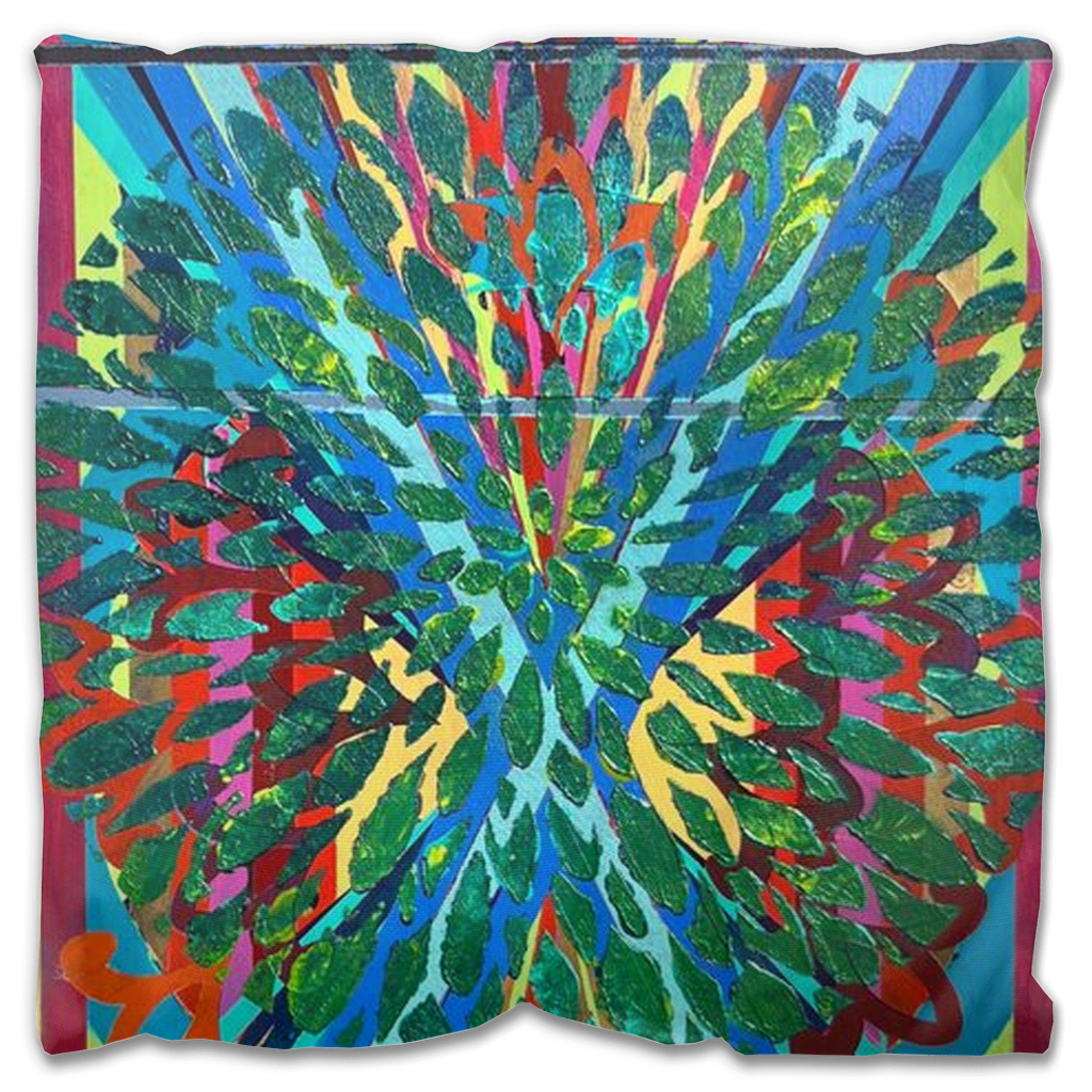
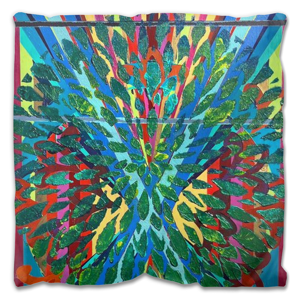
ABOUT THE PAINTING:
BOUNTIFULNESS: Acrylic on canvas, 2 x 1 FT, 2024.
This piece is about limitations and expansions. The thing is, when I start a piece, I rarely have a construct going into the work. Don’t get me wrong, there are many times throughout my career that I’ve had concepts for series and such but, as a standalone piece, I often just pick a color. For instance, this piece started in the deep violet you can see on the sides as well as bars both above and below the focal. Picking that first color to cover a blank canvas is the hardest part of the whole piece, if you can believe it. Here is wherein lies the limitations: color.
As a musician is tasked to make an original piece with only so many notes on a scale, visual artists are really only playing with variants of three primary colors and maybe a white or a black. “But, what about ROY G BIV?” one may ask. Sure, the rainbow is the natural spectrum of colors we all know. Yet, if you think about it, rainbows are the primary colors of red, yellow and blue with buffers which allow primary colors to blend into secondary colors of orange, green and different shades of purple. Of course, this is a simplistic way of parsing a color wheel and I’m not going to get into the logistics of complimentary colors or tertiary shades or warm versus cool values. Color theory is a tool I use in my work but not necessarily something I can summarize in a paragraph for those who are actually interested. That said, these are all thoughts I’m pondering as I begin a piece, as that first ground that covers the blank canvas is drying.
This piece was originally about expansion with the dynamic diagonals overlying the rigid vertical lines… somewhere along the way, thinking about how limiting colors can be, I saw one of the many magnets on my fridge that reads “Bloom where you’re planted.” It was from there I masked off the basket. Here’s a little-known fact about me: I never use black from a tube in my paintings, don’t even own a black. That basket is all painted from purples, yellows, reds, golds… can’t really remember what all colors but it sure was fun playing with them! And, would you believe it, the limitations became bountiful.


