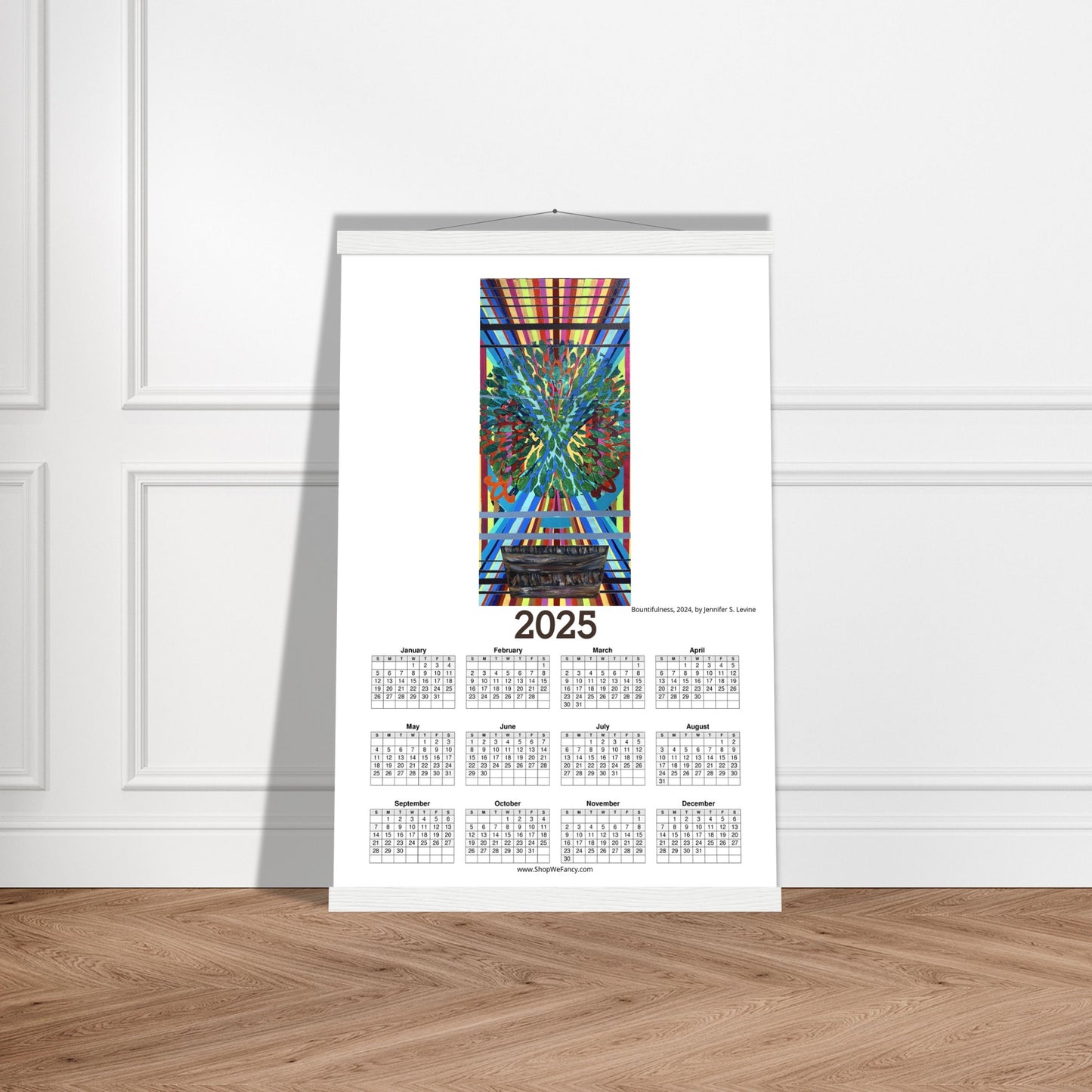
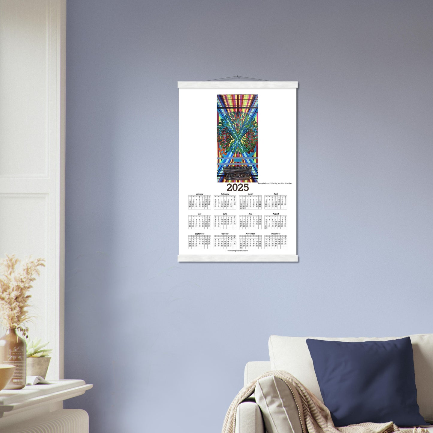
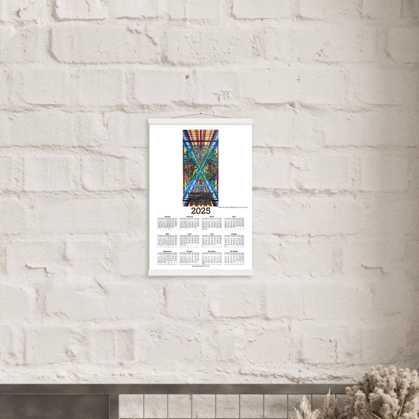
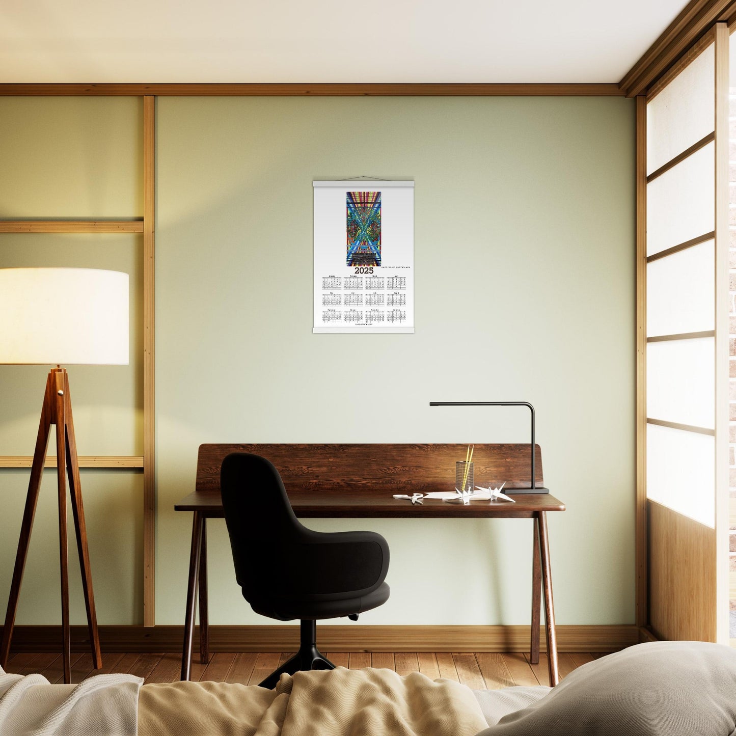
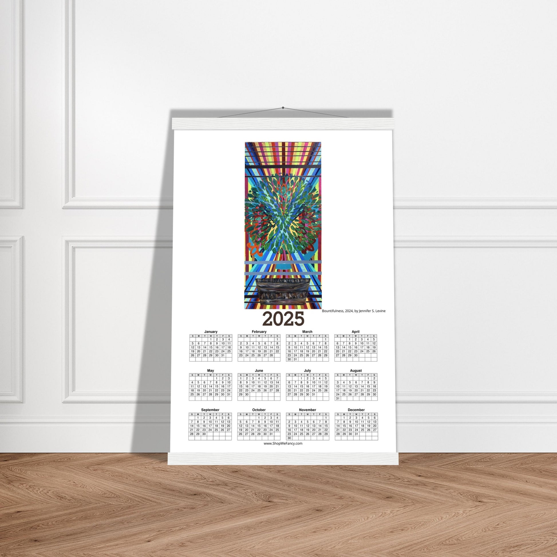
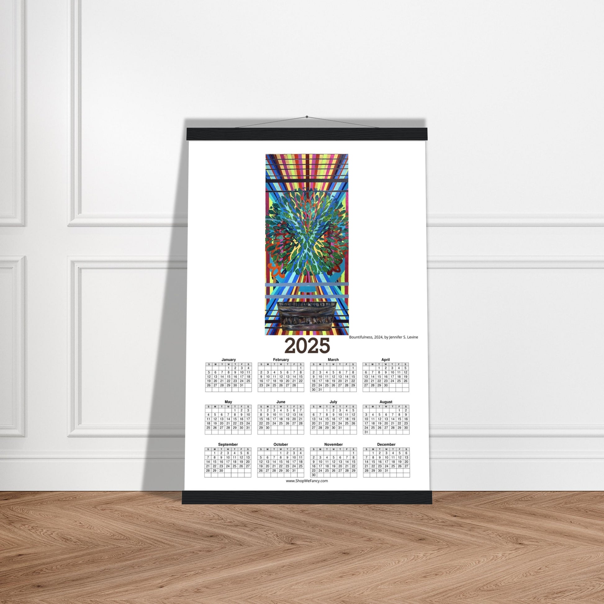
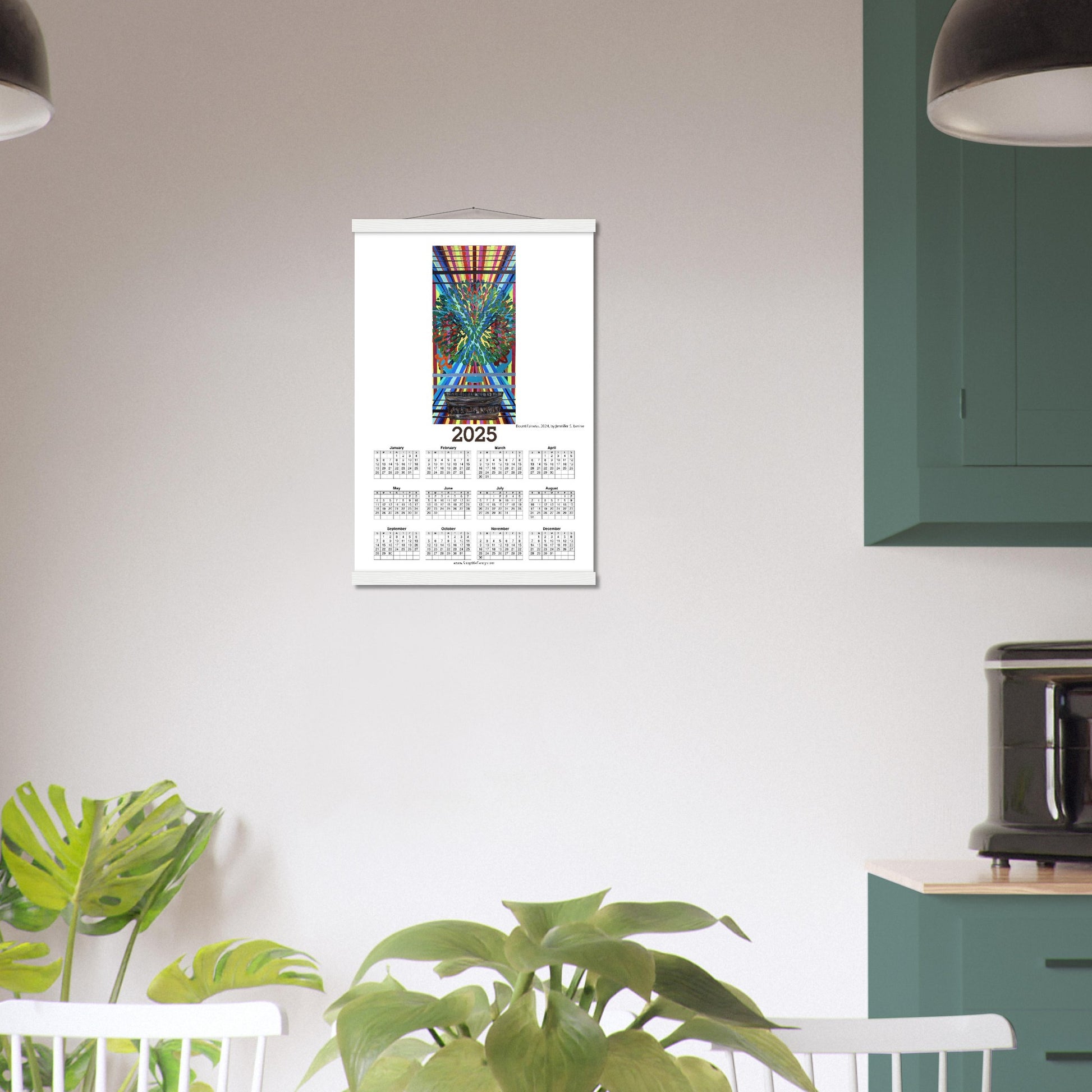
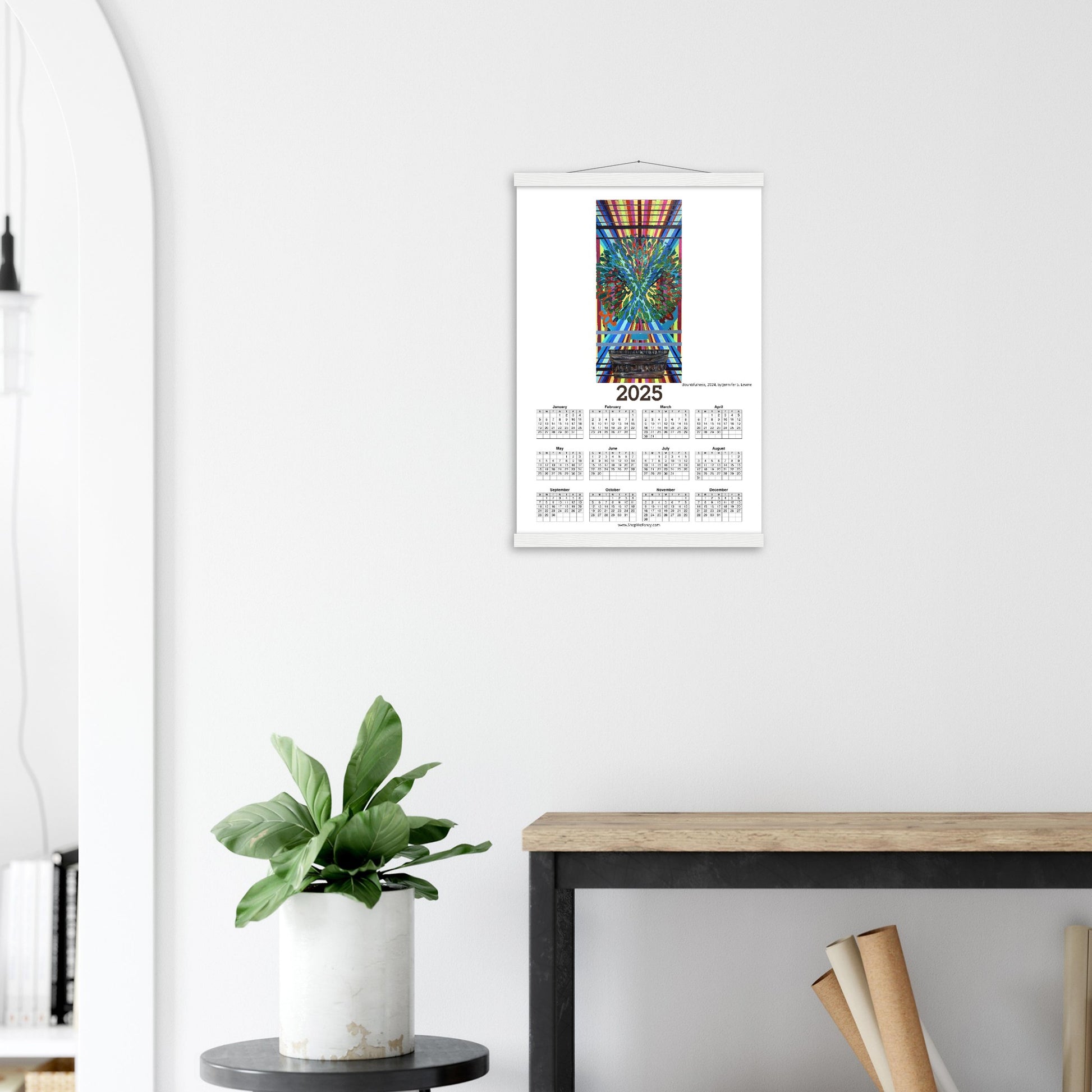
BOUNTIFULNESS 2025 Year at a Glance on Premium Matte Paper Calendar with Hanger
BOUNTIFULNESS 2025 Year at a Glance on Premium Matte Paper Calendar with Hanger
Couldn't load pickup availability
Our minimalist wooden hangers are made with four magnetic wooden dowels, two that clamp to the top of your print and two that clamp to the bottom to give a vintage look and feel. The poster is made with heavier-weight white matte paper that has a natural, smooth uncoated finish that feels luxurious to the touch.
While the poster and hangers are packed separately in one box, final assembly is required. Don’t worry; it's a snap to put them together!
Features:
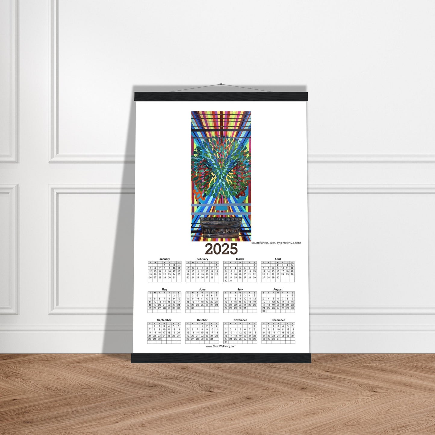
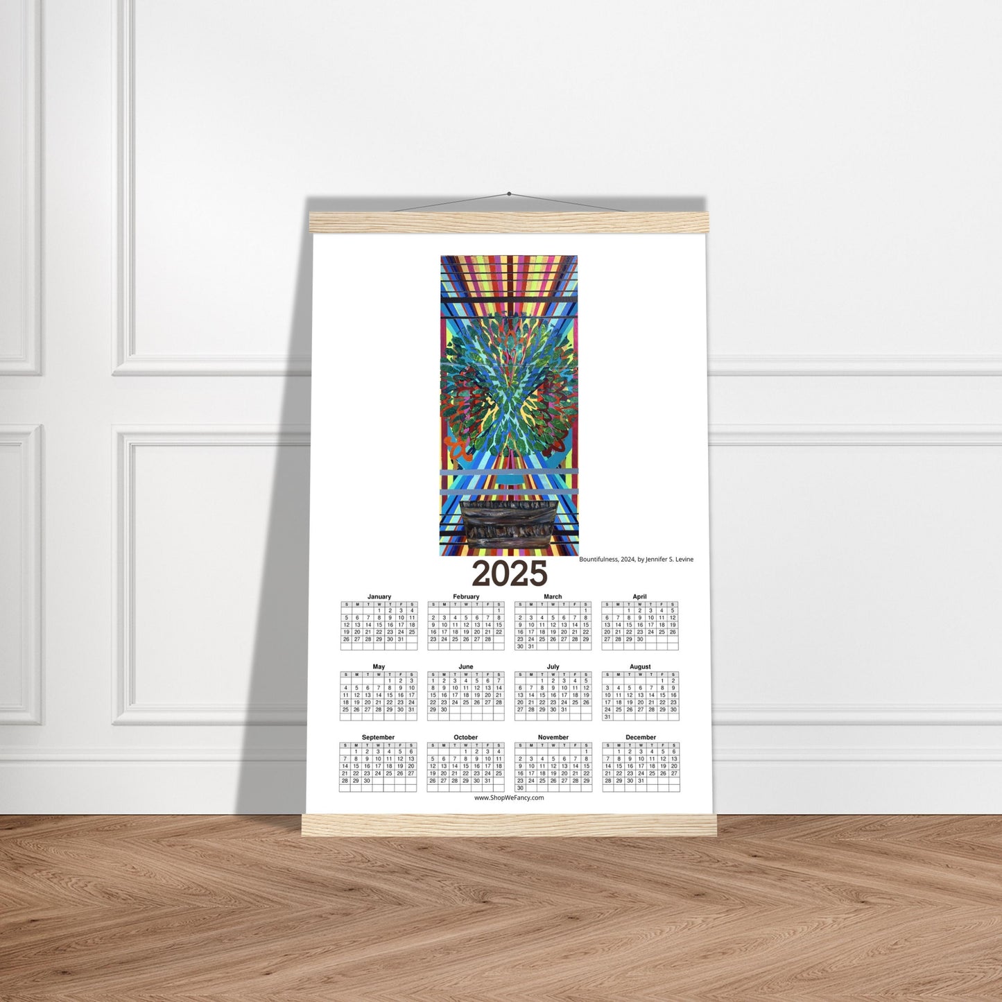
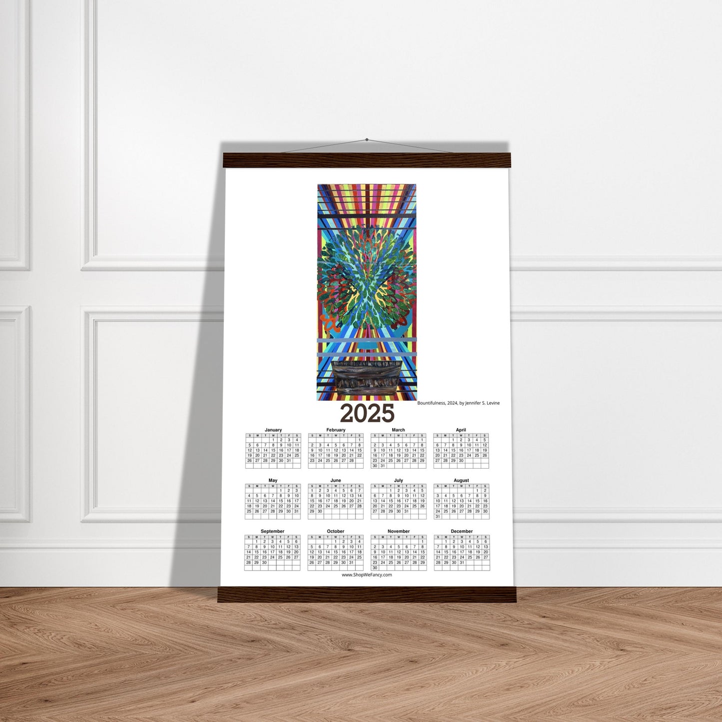
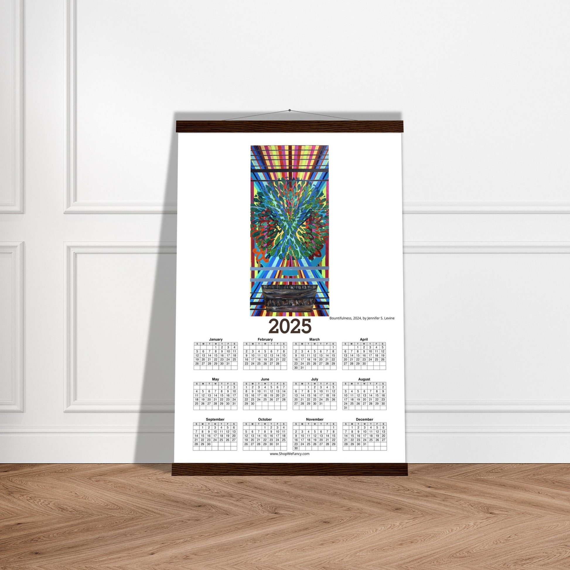
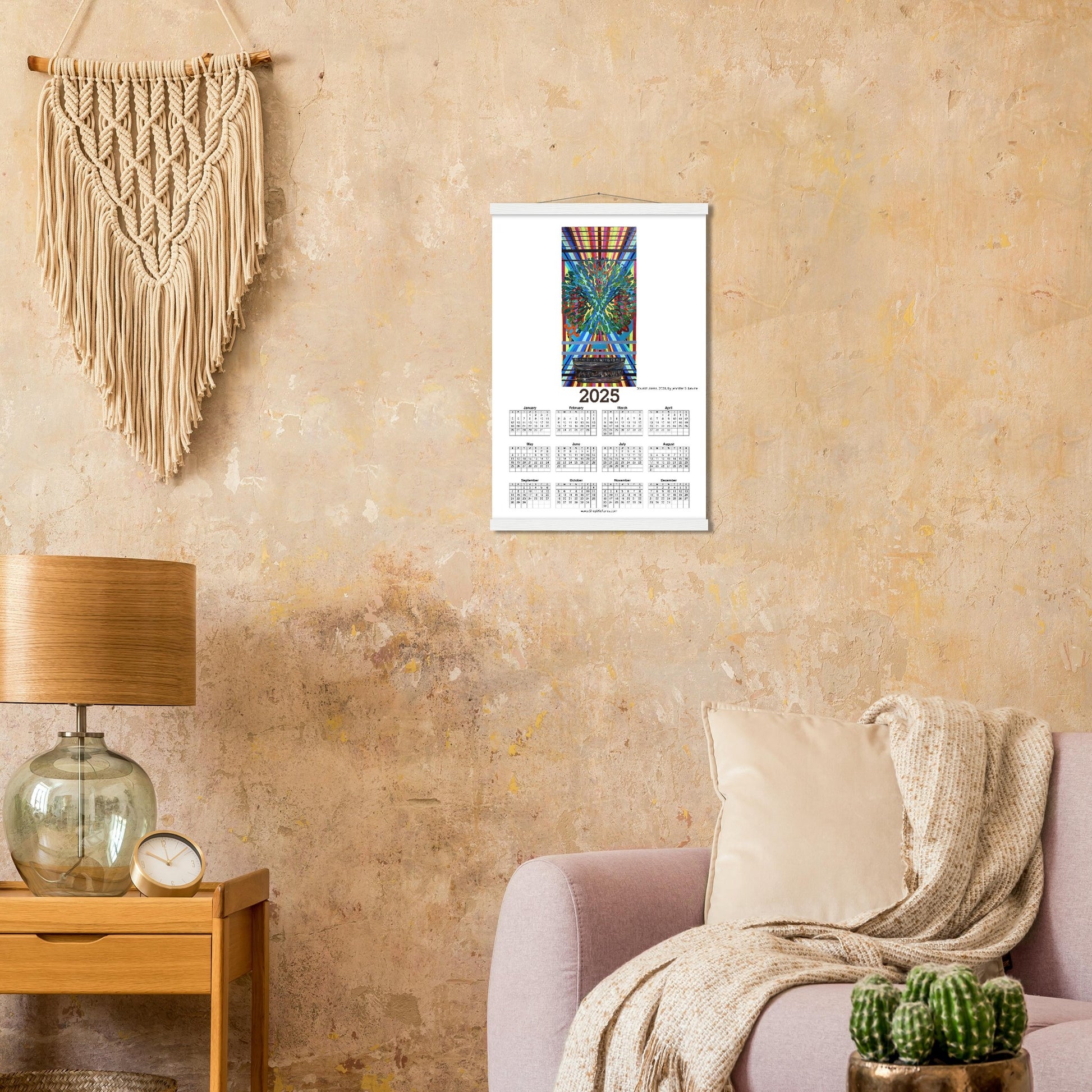
- The hangers are made from pine and come in natural wood, white, black or dark wood.
- The cotton rope attached at the top matches the hanger color.
- Designed magnetically, the hangers do not damage the poster and also makes it easy to switch prints, making it a versatile and durable option.
- The 200 gsm / 80 lb paper weight makes it durable and long-lasting.
- FSC-certified paper and hangers or equivalent certifications, depending on regional availability. It’s better for the people and the planet.
- Each poster and hanger is shipped in robust packaging, ensuring it arrives in pristine condition.
- Paper sizes may vary slightly by region. For the US and Canada, the measurement is in inches, while for the rest of the world, it is in centimeters.
ABOUT THE PAINTING PRINT ON THE CALENDAR:
Bountifulness, acrylic on canvas, 2 x 1 FT, 2024.
This piece is about limitations and expansions. The thing is, when I start a piece, I rarely have a construct going into the work. Don’t get me wrong, there are many times throughout my career that I’ve had concepts for series and such but, as a standalone piece, I often just pick a color. For instance, this piece started in the deep violet you can see on the sides as well as bars both above and below the focal. Picking that first color to cover a blank canvas is the hardest part of the whole piece, if you can believe it. Here is wherein lies the limitations: color.
As a musician is tasked to make an original piece with only so many notes on a scale, visual artists are really only playing with variants of three primary colors and maybe a white or a black. “But, what about ROY G BIV?” one may ask. Sure, the rainbow is the natural spectrum of colors we all know. Yet, if you think about it, rainbows are the primary colors of red, yellow and blue with buffers which allow primary colors to blend into secondary colors of orange, green and different shades of purple. Of course, this is a simplistic way of parsing a color wheel and I’m not going to get into the logistics of complimentary colors or tertiary shades or warm versus cool values. Color theory is a tool I use in my work but not necessarily something I can summarize in a paragraph for those who are actually interested. That said, these are all thoughts I’m pondering as I begin a piece, as that first ground that covers the blank canvas is drying.
This piece was originally about expansion with the dynamic diagonals overlying the rigid vertical lines… somewhere along the way, thinking about how limiting colors can be, I saw one of the many magnets on my fridge that reads “Bloom where you’re planted.” It was from there I masked off the basket. Here’s a little-known fact about me: I never use black from a tube in my paintings, don’t even own a black. That basket is all painted from purples, yellows, reds, golds… can’t really remember what all colors but it sure was fun playing with them! And, would you believe it, the limitations became bountiful.
